

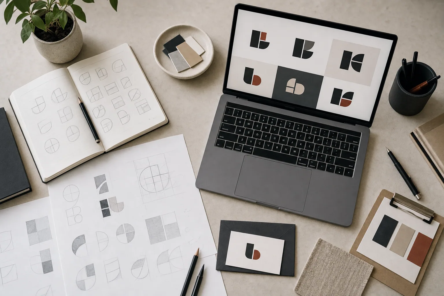
A good logo is the result of process, not luck. Many business owners think a logo should just happen: a designer sits down, sketches something clever, and the mark is done. The reality is different. A real logo design process involves discovery, strategy, sketches, refinement, feedback, and testing. Each step builds on the last.
When FultonStudio works with a client on logo and tagline creation, the goal is to create a mark that reflects what the business actually does, feels right to the owner, and works across different sizes and applications. That takes time and intention.
Here is how a professional logo design process unfolds from initial concept through the final mark.
Step One: Discovery and Business Understanding
Before any sketches appear, the designer needs to understand the business. This is not a generic step. The mark should feel connected to the work.
During discovery, you should expect questions like:
- What does the business do, and who are the main customers?
- What makes this business different from competitors?
- Is there a personality or tone the owner wants to convey?
- What does the owner like and dislike visually?
- Will the logo need to work on a website, business card, signage, social media, or other places?
- Are there any existing colors, fonts, or visual themes to honor or change?
This conversation determines what the designer will explore. A logo for a luxury cabinetry business looks and feels different from a logo for a wellness studio, even though both require professionalism and clarity. Discovery ensures the concept moves in the right direction from the start.
Step Two: Visual Direction and Concept Development
Once the designer understands the business, they explore visual concepts. This usually means sketching, collecting reference images, studying competitor marks, and testing ideas.
At this stage, the designer is answering a core question: what visual idea best represents this business?
A logo concept might be:
- An abstract mark based on the business name or a key idea
- A symbol or icon that represents what the business does
- Letterforms or a monogram using the owner's initials or business initials
- A combination of a symbol and custom lettering
- A wordmark where the typography itself becomes distinctive
Many concepts are explored and many are rejected. The goal is not to show the owner every sketch. The goal is to narrow down to two or three strong directions that feel right.
Step Three: Initial Sketches and Refinement
Once the direction is chosen, the designer moves from rough sketches to refined concepts. This is where the mark becomes intentional.
At this stage:
- Proportions are tested and adjusted
- Multiple versions might be explored (with or without a tagline, with or without a symbol)
- The mark is checked at different sizes to ensure it reads clearly
- Negative space is refined so the mark feels balanced
- Simple variations are created for black-and-white use, color use, and small applications
The designer is looking for a mark that is memorable, simple enough to reproduce, and specific enough to feel like it belongs to this business and no other.
Step Four: Client Feedback and Iteration
Once the designer has refined concepts, they present them to the owner. This is where feedback matters.
Good feedback is specific. Instead of "I don't like it," more useful feedback is "This feels too formal for our audience" or "I like the concept but the letters feel cramped." Feedback like that tells the designer what to adjust.
After feedback, the designer refines the mark. Some versions might be simplified. Others might be redrawn. The symbol might be repositioned relative to the type. Colors might change.
Multiple rounds of feedback are normal. A logo is not a single sketch. It is a refined object that gets better with intentional adjustment.
Step Five: Testing at Different Scales
Before finalizing, a good logo design process includes testing.
The mark needs to work:
- At large scale on a sign or billboard
- At small scale on a business card or social media avatar
- In black and white for faxes, photocopiers, or embossing
- In color on the website
- On different backgrounds
- When printed and when digital
A mark that looks great at 6 inches might break apart at 1 inch. A mark that looks good on white might disappear on a photo background. Testing catches these issues before the logo goes into the world.
Step Six: Final Delivery and File Preparation
Once the mark is approved, the designer delivers a complete set of files. These should include:
- A primary version (color, with or without a tagline)
- Variations (black and white, reversed, stacked, horizontal)
- Files at different scales
- File formats for different uses: vector files for print and large applications, web-ready versions for the website
- A simple guide showing how the logo should and should not be used
A well-delivered logo comes with clarity. The owner should know which file to use on the website, which to send to a printer, and which to use for social media. Confusion about files wastes time and money later.
Why Professional Logo Design Takes Time
Rushed logos often look generic. They lack the specificity and intention that comes from real discovery and refinement.
A professional logo design process takes weeks, not days. It includes conversation, sketching, feedback, iteration, and testing. Each step removes mistakes and refines the mark.
When FultonStudio works with clients on branding, the logo is connected to the larger brand strategy. The mark should feel consistent with the business voice, the website direction, the photography style, and the overall visual system. A mark does not live alone. It lives within a larger presentation.
If your business needs a logo that reflects what you actually do, or if you have an existing mark that needs refinement or testing, FultonStudio can help. Brand strategy includes logo concept, exploration, and a mark that feels intentional and right for your work. Start by requesting a site and brand review, or reach out to discuss what your mark should communicate.