

More than half of web traffic comes from mobile devices. A website that works only on desktop is not really a website anymore. It is a missed opportunity.
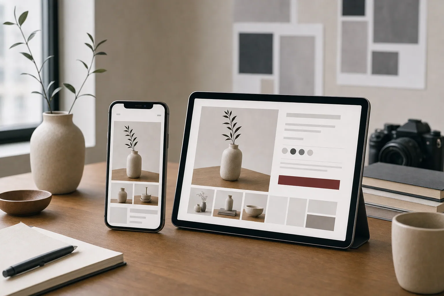
Responsive website design means building a site that adapts to any screen size. On a phone, the layout shifts, text stays readable, buttons are easy to tap, and images scale properly. On a tablet or desktop, the same site spreads out and uses the available space. The content stays the same. The experience changes.
When a site is not mobile friendly, visitors bounce. They leave because they cannot read the text, buttons are too small, the menu is broken, or images take forever to load. A mobile-first approach prevents all of that.
Why Mobile Friendly Website Design Matters Now
Google ranks mobile-friendly sites higher in search results. That alone is reason enough to build responsively. But there is a bigger reason: your actual customers are on phones.
If you run a local service business, a wellness practice, a restaurant, a salon, or a creative studio, most of your visitors are searching on mobile. They are looking for your phone number, your hours, directions, or examples of your work. If they cannot find those things easily on a phone, they call your competitor instead.
A responsive website design is not a luxury feature. It is the baseline expectation. A site that looks good on mobile does not just rank better. It converts better. It builds trust faster. It makes it easier for the right customer to take the next step.
The Basics of Responsive Design Best Practices
Responsive design is built into the structure from the start, not bolted on later. Here are the key principles:
-
Flexible layouts: The page width adjusts to the screen, not the other way around. A three-column desktop layout becomes two columns on a tablet and one column on a phone.
-
Readable text: Font sizes, line spacing, and line length should work on small screens. Tiny text on a phone creates friction.
-
Touch-friendly buttons: On a phone, a button needs to be at least 44 to 48 pixels tall. Tiny clickable targets frustrate users.
-
Scaled images: Images should not be too large (slow to load) or too small (pixelated). The image size should adapt to the screen.
-
Smart navigation: Desktop menus with hover effects do not work on phones. Mobile navigation needs to be simple, tappable, and easy to close.
-
Fast load times: Mobile users often have slower connections. Oversized images, too many scripts, and unoptimized code slow things down.
When FultonStudio plans a website, responsive design is built in from the start. We design for mobile first, then expand the layout for larger screens. Every page is tested on actual devices to make sure buttons work, text reads clearly, and images load properly.
Mobile Web Design vs. Desktop Design Thinking
Mobile design is not just desktop design squeezed onto a smaller screen. It is a different way of thinking about how people use your site.
On desktop, visitors might scroll through a long homepage and explore multiple menu items. On mobile, they are often looking for one specific thing: a phone number, a booking form, a product, or a service description. They want to get in, find it, and act.
That means:
Clear, scannable headings matter more. On mobile, a visitor needs to understand what the page is about in under two seconds.
Calls to action should be prominent. A "Book Now" button or "Contact" link should be easy to find and tap, not buried at the bottom of a long page.
Forms should be short. If a form takes five screens to complete on a phone, most visitors will abandon it.
Images should support the message. A hero image on desktop might be beautiful and large. On mobile, it needs to crop intelligently and still tell the story.
When content is organized well, the same website works beautifully on all screen sizes. Visitors on phones get a focused experience. Visitors on desktops get more detail and breathing room.
Common Mobile Website Design Mistakes
Many sites claim to be mobile friendly but fall short. Here are the problems we see most often:
Unreadable text: Small font sizes, low contrast between text and background, or lines of text too long to scan comfortably.
Broken navigation: A menu that works on desktop but collapses or becomes confusing on mobile. Or a menu that opens but never closes.
Slow loading: Large images, excessive scripts, and unoptimized code make pages painful to use on cellular connections.
Bad image cropping: Images that look great on desktop are cut off or distorted on mobile, making the page look amateurish.
Tiny buttons and links: Touch targets that are hard to tap, especially for older users or in low-light conditions.
Auto-playing video or audio: Videos that auto-play drain data and are jarring for mobile users.
Unusable forms: Forms with too many fields, poor labeling, or fields too close together to tap accurately.
Fixed navigation that blocks content: A header that stays at the top and takes up half the screen on mobile.
These are not small problems. They are reasons people leave your site and visit someone else's. A responsive website design that works well on mobile removes all of those friction points.
How to Test Your Site on Mobile
Before you launch a site, test it on real phones. Here is what to check:
Load a page. Does it render correctly? Do images appear? Do all the text and buttons show up?
Scroll and read. Can you scroll smoothly? Is the text easy to read without zooming in?
Tap buttons and links. Are they easy to tap without hitting the wrong target? Do they respond quickly?
Test forms. Can you fill out a form easily? Can you see what you are typing? Does it submit correctly?
Check your phone number. If you list a phone number, can a visitor tap it to call you directly?
Test search visibility. Are the most important pages easy to find from the homepage?
Use different phones. Test on an iPhone and an Android phone if possible. Test on different screen sizes.
Google's Mobile-Friendly Test is free and useful. But the best test is real human use. Ask someone to visit your site on their phone and watch what they do. Do they find what they need? Do they feel confident taking the next step?
Building a Responsive Website That Converts
A responsive website is the foundation. But a responsive website that actually works comes from thinking about the whole experience: the strategy, the content, the visuals, and the flow.
When FultonStudio designs a website, we start with the business. What does it do? Who is visiting? What do they need to understand quickly? What action should they take next? Then we build the site to support that.
Responsive design is the technical part. But the design also needs strong visuals, clear copy, readable service pages, and easy navigation. A site can be responsive and still confuse visitors if the message is unclear or the images are weak.
That is why website planning and development starts with strategy, not templates. We make sure the site is built around the business, not squeezed into a generic responsive template.
Photography and visual direction also matter. Strong images help visitors understand your business and feel confident. Weak images or stock photos can make a responsive site feel generic.
Content and SEO-friendly page writing ensures your site ranks for the right searches and reads clearly on all devices. The same copy needs to work on a tiny phone screen and a large desktop. That means short paragraphs, clear headings, and sentences that communicate quickly.
A Mobile Website Design That Works for Your Business
Responsive design is not optional anymore. It is the way websites work. The question is not whether to build responsively. The question is whether your responsive site is actually helping your business.
A mobile friendly website should make it easier for visitors to understand what you do, find what they need, and take the next step. It should load fast, read clearly, and feel professional. It should adapt to any device without requiring the visitor to zoom, scroll horizontally, or struggle.
If your current site feels outdated on mobile, loads slowly, or makes it hard for visitors to find your phone number or contact form, it is time to rebuild. A new responsive website built around your actual business, with strong visuals and clear content, can change how customers perceive you.
Ready to explore what a stronger mobile website could do for your business? Request a site review to see where your current site stands and what a responsive rebuild could improve.