

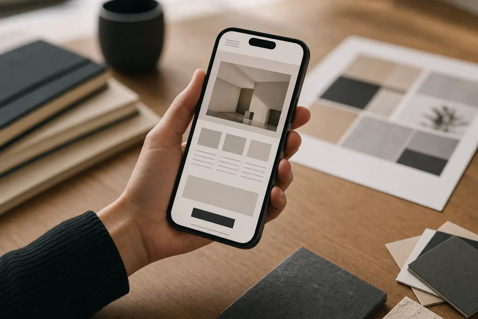
Most of your website visitors are using a phone. Not a laptop or tablet. A phone. Yet many business websites still feel like they were designed for a desktop first, then squeezed onto a mobile screen as an afterthought.
That matters more than you might think. If your mobile website design is hard to read, slow to load, or difficult to tap through, visitors leave. They don't wait for a better experience. They move to a competitor who made it easier.
This article explains why mobile website design has become essential, what goes wrong on phones, and how to know if your site needs a fix.
Mobile traffic is the baseline now
A few years ago, businesses debated whether they needed a mobile website. That conversation is over. Today, more than half of all web traffic comes from mobile devices. For many service businesses, wellness brands, and local companies, it's 60 to 70 percent.
Your phone-using customers are looking for your services, reading your pages, clicking your links, and deciding whether to call or book an appointment. If your site works poorly on mobile, you are actively losing business.
The question is no longer "Do we need mobile design?" It is "Does our mobile design actually work?"
What makes mobile website design fail
Responsive website design means your site adjusts its layout, text size, and navigation to fit any screen. In theory, it sounds simple. In practice, many sites claim to be responsive but still create problems for phone users.
Common mobile design failures include:
- Text that is too small to read without pinching and zooming
- Images that are so large they slow down the page on slower connections
- Navigation menus that are hard to tap or confusing to move through
- Buttons and forms that require precise tapping and feel clumsy on a phone
- Pages that are so long visitors give up before finding what they need
- Slow load times that frustrate impatient visitors
- Pop-ups and sticky elements that take over the screen
Many of these problems come from websites built on outdated templates or designed for desktop first, then scaled down without real thought. A mobile responsive website is not just a smaller version of your desktop site. It is a whole different experience that needs planning.
Mobile first design is the better approach
FultonStudio builds websites using a mobile first approach. This means starting with the phone experience and building up to larger screens, not the other way around.
When you design for mobile first, you have to make hard choices about what matters. You cannot fit everything on a small screen. You have to prioritize your message, simplify your navigation, and make each element count. That discipline makes the desktop version stronger too.
Mobile first design also forces you to think about speed. A phone on a slower connection teaches you a lot about unnecessary images, bloated code, and wasted resources. By the time your site reaches a desktop user on a fast connection, it performs beautifully.
How mobile website optimization connects to SEO
Google ranks mobile-friendly sites higher in search results. This is not a minor detail. Google uses mobile-first indexing, which means it looks at your mobile version first when deciding where your site ranks.
If your mobile website design is poor, your search visibility suffers. You may rank lower for your services, lose local search visibility, and find it harder to compete for customers searching on phones. That is a direct business impact.
When FultonStudio builds or redesigns a website, mobile optimization and search strategy work together. Better mobile design supports better SEO performance, and a solid SEO strategy makes sure your mobile site is structured in ways Google understands.
Signs your site needs a mobile redesign
If any of these sound familiar, your mobile website design likely needs attention:
- Visitors spend most of their time on your site coming from phones, but your phone experience feels clunky or hard to navigate
- Your mobile bounce rate is much higher than your desktop bounce rate (visitors leave the phone version faster)
- Your site was last redesigned more than 3-4 years ago and looks or feels outdated
- You get complaints or questions about your site being hard to use on a phone
- Your site works on phones but loads slowly or feels sluggish
- Your mobile pages rank poorly in search results, even though your desktop pages perform better
- You cannot easily update your own site because the backend is hard to manage
Each of these points to a deeper problem that affects how customers experience your business.
What a strong mobile experience includes
A mobile website that works well shares certain qualities:
- Readable text without zooming (at least 14-16 pixels for body text)
- Tap-friendly buttons and links that are large enough to hit with a thumb
- Fast load times, especially on slower 4G or 5G connections
- A clear, logical navigation structure that does not require digging
- Images that load quickly and look crisp on high-resolution phone screens
- Forms that are easy to fill out on a small keyboard
- A call-to-action or next step that is obvious and easy to tap
- Content that is scannable, with short paragraphs and clear headings
These are not luxury features. They are baseline expectations. A visitor on a phone is not asking for fancy design. They are asking for clarity and ease.
How to start fixing mobile problems
If your site needs mobile work, a good first step is a honest review. Open your site on your own phone and use it the way a customer would. Try to find a service, read a page, and tap a call-to-action button. How does it feel?
Then test it on someone else's phone. Different phones, different browsers, different screen sizes all behave differently. What looks good on your phone might not work on someone else's.
If the experience is rough, you have options. Sometimes mobile problems are surface-level fixes. Other times they require a bigger rethink of how your site is built and organized. When FultonStudio works with businesses, website planning and design go together. The site structure and content organization are built with mobile and desktop in mind from the start.
The bigger picture
Mobile website design is not just about fitting content onto a small screen. It is about respecting how your customers actually use the web. Most of them are on phones. Your site should work beautifully for them.
A responsive website that works well on mobile, loads fast, and makes sense to read is also better for your local SEO, your search rankings, and your ability to convert visitors into customers. When FultonStudio builds a site, mobile optimization is not an afterthought. It is part of the foundation.
If you are wondering whether your mobile website design is holding you back, that is worth investigating. Start by using your site on a phone. If it feels awkward or outdated, your customers feel it too.
Ready to see how your site performs? Contact FultonStudio for a website review, or explore how custom website design and mobile-first planning can clarify your business online.