

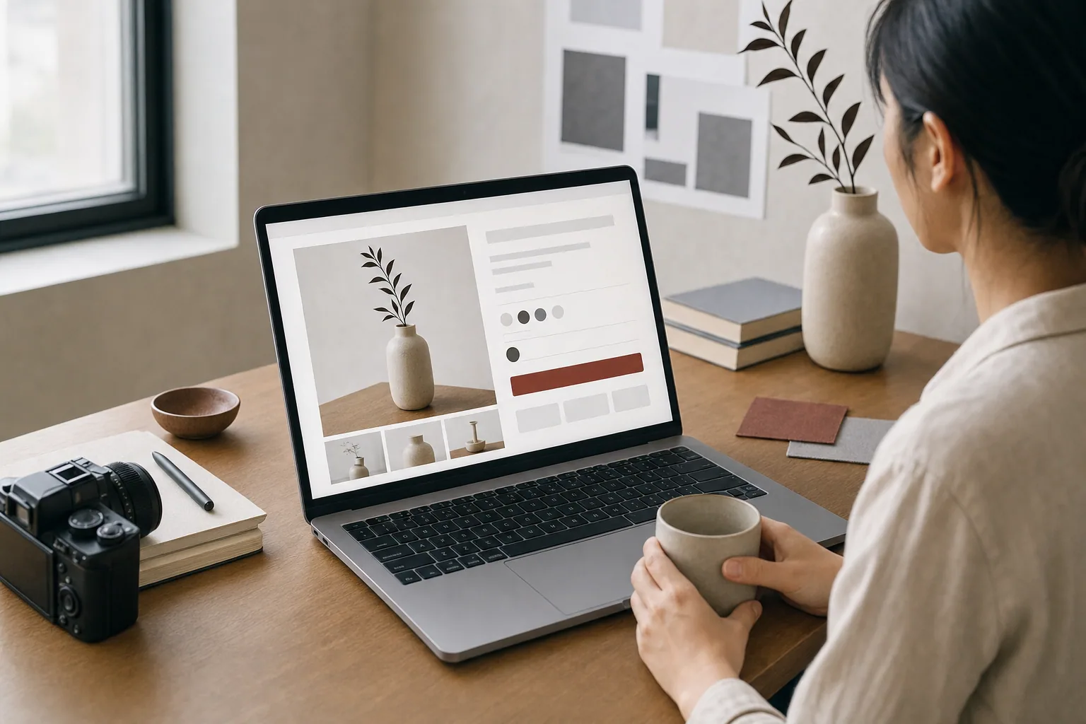
Your product page is not a brochure. It is a salesperson.
When someone lands on a product page, they are already interested. They found your site, navigated to the product, and decided it might be worth their time. Your job now is to answer their questions fast, build confidence, and make buying feel obvious.
Many product pages fail because they treat every product the same. A generic layout does not work for a luxury handbag, a technical service, an artwork, or a handmade good. The page design, copy, and images need to work together to tell the story of what you are selling and why someone should buy it from you.
What a Strong Product Page Does
A good product page layout guides the visitor through a clear path. They see what the product is, understand why it matters, find answers to common questions, and know how to buy it. No hunting. No confusion.
Here is what happens in that path:
- The hero image or video shows the product in context, not just a flat shot
- The headline and short description state what you are selling and who it is for
- Key details like size, material, dimensions, or specs are easy to find
- Photography or lifestyle images show the product in use
- The description explains benefits, not just features
- Social proof, reviews, or case details build trust
- Pricing is clear and the call to action is obvious
- Related products or options help the visitor explore more
Each of these elements serves a purpose. Missing one of them creates friction.
The Layout Structure That Works
Most successful product pages follow a similar anatomy, even if they look very different visually.
The hero section is the first real estate. This is where your best image lives. It should show the product in a way that makes sense for what you are selling. A luxury brand might use a clean studio shot. A handmade business might show the product in a home setting. A technical product might include the product and its context side by side.
The product title and key information should appear near that hero image, not buried below the fold. Visitors should know what they are looking at within two seconds of landing on the page.
The description section then tells the story. This is not the place for keyword stuffing or generic marketing language. Write as if you are explaining the product to a friend. Why did you make it? What problem does it solve? What makes it different?
For product descriptions to work, they need to balance features with benefits. A feature is what the product has. A benefit is what that feature does for the buyer. "Handmade leather" is a feature. "Built to last decades and age beautifully" is the benefit.
Images should repeat throughout the page. Show the product from multiple angles. Show it in use. Show details. Show scale. If the product is an artwork or limited edition, show it in different lighting. If it is apparel, show it on a person. For e-commerce photography, originality matters more than perfection. A real photograph of your product taken in your space beats a generic stock photo.
Why Standard Templates Fall Short
Many e-commerce platforms offer default product page layouts. They work fine for moving generic goods, but they do not tell your story.
If you sell luxury items, a template designed for fast-moving goods makes your work look cheap. If you sell one-of-a-kind artwork, a template that shows "Related Products" four times will confuse your visitor. If you are a service business using product pages as intake, a standard layout wastes the space where your process should live.
A custom product page layout is built around how you actually sell. That might mean more space for storytelling. That might mean a larger image gallery. That might mean a custom form instead of a generic add-to-cart. That might mean a workflow that walks the visitor through options before checkout.
When FultonStudio works on product pages, the question is not "How do we fit into the template?" It is "What does this product actually need to communicate, and how should the page be organized to do that?"
Copy That Converts Without Hype
The words on a product page do most of the heavy lifting. A beautiful layout means nothing if the visitor does not understand what they are buying.
Clear product copy answers the questions visitors actually have:
- What is this?
- Who is it for?
- What is it made of? How does it work?
- Why should I buy this instead of something similar?
- What are the options, sizes, or variations?
- What happens after I buy it?
The headline should be specific. Not "Elegant Hand-Stitched Bag" but "Leather Weekender Built to Last 20 Years." The difference is small, but it tells the visitor why the price is what it is.
Descriptions should sound like a real person explaining something, not a marketing team writing bullet points. Phrases like "we source leather from a supplier we have worked with for eight years" build more trust than "premium materials" ever will.
Calls to action should match the visitor's stage. Early in the page, explore options. At the end, buy now. If you offer consultations, show a button for that too. Not every visitor is ready to buy. Some need to ask a question first. Let them.
Images Are Not Optional
Photography is the difference between a product page that converts and one that does not.
Weak images make people doubt. Is the product really that color? Will it look like that when it arrives? Is it actually that big? Good images remove doubt.
This does not mean expensive. It means intentional. A photograph taken in your space, with your lighting, showing your actual product, will always beat a stock photo. Your visitor can sense authenticity. They can also sense when you took a shortcut.
For websites with many products, professional product photography becomes essential. Each image should be cropped and sized correctly for mobile, tablet, and desktop. Each should have a clear subject and good lighting. Each should show what the product actually looks like.
When you redesign or launch a product page, consider whether image creation and photography is part of the project. Better images often matter more than better design.
Building Product Pages Into Your Overall Site
Product pages do not exist alone. They are part of a larger website system.
If you sell multiple items, how are they organized? Is there a category system? Can visitors filter by size, color, price, or material? Are related products shown in a smart way?
If you take product orders, what happens after someone buys? Is there a confirmation page? Do they get a receipt? Can they track status?
If you sell limited editions or artwork, how do you show what is sold out versus available?
If you use a service model instead of a shop, are your product pages actually service pages with custom forms or intake workflows?
These questions matter because they change how the product page fits into the site. A well-designed product page can fail if the broader site structure is confusing or the customer journey breaks at checkout.
When building e-commerce websites, website planning and development includes thinking about how products are discovered, how they are presented, and how customers move from browsing to buying.
Getting Your Product Pages Right
Product page design is not generic. It depends on what you sell, who you sell to, and how you want your business to feel.
Start by looking at your current product pages. Ask yourself:
- Do visitors understand what they are buying in the first ten seconds?
- Are the images strong enough to build confidence?
- Is the copy clear or does it sound like marketing speak?
- Can someone easily find pricing, options, and how to buy?
- Do related products or next steps make sense?
- Does the page feel like your brand or like a template?
If you answer no to any of these, your product pages are leaving money on the table.
A product page redesign usually includes clearer copy, better images, a layout built for how you actually sell, improved calls to action, and a customer path that makes sense. It is not a small fix, but it is usually not a full site rebuild either.
If you are not sure where to start, consider a website review. An audit can show you what is working, what is confusing, and what changes would make the biggest difference.
Your product pages should sell as well as your actual products. They should look professional, explain what you offer clearly, show your work honestly, and make the next step obvious. When product design, copy, and images work together, they do not just move inventory. They build trust and show customers why they chose the right place to buy.