

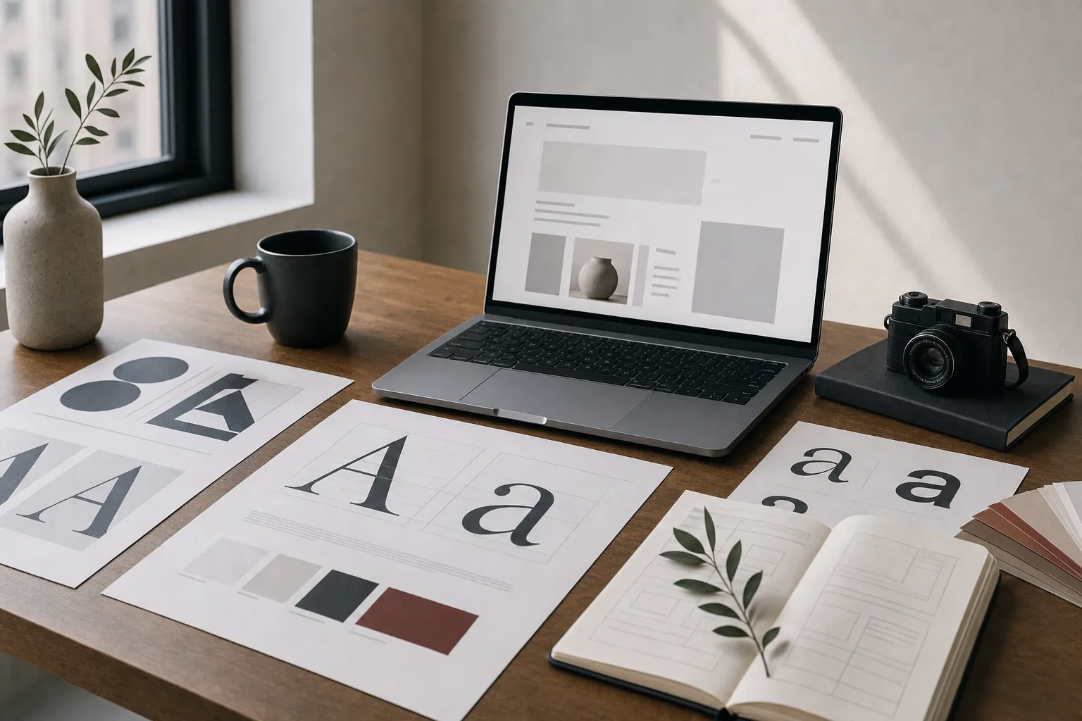
Choosing a font for your website matters more than you might think. The typeface you pick affects how easy your site is to read, how professional it looks, and whether visitors trust what they are seeing. The most common choice business owners face is whether to use a sans serif font or a serif font. Each has real strengths, and the right choice depends on your business, your audience, and what you are trying to communicate.
What Are Serif and Sans Serif Fonts?
Serifs are small lines or feet that extend from the ends of letters. A serif font like Georgia or Times New Roman includes these decorative strokes. Sans serif means without serifs, so fonts like Arial, Helvetica, or Open Sans have clean, straight edges with no decorative flourishes.
Serif fonts feel traditional, formal, and established. They are often used in print, law, finance, and publishing because they carry a sense of authority. Sans serif fonts feel modern, clean, and straightforward. They are easier to scan on screens and have become the standard for websites, apps, and digital interfaces.
Neither is wrong. The question is which one fits your business and your message.
Sans Serif Dominates Web Design for Good Reasons
Most websites today use sans serif fonts for body text and headlines. This is not a trend or fashion choice. It is based on how screens render text.
When text is small on a screen, serif fonts can look cluttered or blurry because the small decorative lines do not render cleanly at low resolutions. Sans serif fonts have simpler shapes, so they stay readable even at small sizes. This is especially true on mobile phones, where screen resolution is lower and text needs to stay crisp.
Sans serif fonts also feel faster to scan. Visitors to your website are usually in a hurry. They want to find information quickly. Sans serif typography supports that goal. It pairs well with white space, clear page hierarchy, and organized content.
Common sans serif choices for websites include:
- Helvetica or Helvetica Neue (clean, timeless, widely available)
- Arial (simple, reliable, safe choice)
- Open Sans (friendly, modern, free and easy to load)
- Montserrat (geometric, contemporary, popular for branding)
- Roboto (clean, versatile, designed specifically for screens)
- Inter (modern, highly legible at small sizes)
When Serif Fonts Still Make Sense
Serif fonts are not obsolete on the web. They still have a place, especially if your business needs to project tradition, authority, or premium positioning.
Law firms, financial advisors, publications, and established institutions often use serif fonts because the style signals experience and stability. If your business is built on trust, heritage, or expertise, a serif typeface can reinforce that message.
Serif fonts also work well for longer body text on desktop screens. If your website includes long articles, case studies, or detailed service descriptions that people will read on a laptop or desktop computer, a serif font can actually make reading more comfortable. The serifs create visual anchors that guide the eye along the line of text.
If you choose a serif font, pick one designed for web use. Georgia was created specifically for screen readability and remains a solid choice. Modern options like Lora, Playfair Display, or Merriweather are also built with digital display in mind and load well across devices.
How Font Choice Affects Your Brand Message
Your website fonts are part of your brand. They communicate before your words do.
A creative agency or tech startup using Playfair Display signals luxury and precision. A wellness brand using a warm, friendly sans serif like Montserrat signals approachability. A law firm using a traditional serif feels established and serious. A boutique using a modern geometric sans serif feels contemporary and curated.
This does not mean overthinking it. It means choosing fonts that match what your business does and how you want to be perceived. If your work is clean and modern, your fonts should reflect that. If your business is built on tradition and trust, your fonts should support that too.
When building or updating a website, font choice should be part of your larger brand strategy. Your typefaces, colors, images, and page structure should all work together to create a consistent impression.
Practical Guidelines for Website Typography
Here are straightforward rules to follow when choosing fonts for your site:
-
Use sans serif for body text on web. It is more readable at small sizes and works better on mobile devices.
-
You can use a serif font for headlines or accents if it fits your brand, but make sure it is large enough to read clearly on phones.
-
Limit your site to two fonts maximum. One for headlines, one for body text. More than that creates visual noise and can make your site feel unprofessional.
-
Choose web-safe fonts or load them from a reliable service like Google Fonts. This ensures your fonts render the same way for every visitor, no matter what device or browser they use.
-
Test your fonts on mobile. What looks good on your desktop might be hard to read on a phone. This is especially important if you use a serif font or anything decorative.
-
Make sure font size and line spacing support readability. Body text should be at least 16 pixels, with generous line spacing. Headlines can be larger and bolder.
-
Stick with standard fonts unless your brand genuinely needs something unique. Unusual typefaces can backfire on slow internet connections or older devices.
Serif vs Sans Serif: A Simple Comparison
| Characteristic | Sans Serif | Serif |
|---|---|---|
| Mobile readability | Excellent | Good if sized properly |
| Professional feel | Clean, modern | Traditional, formal |
| Best for | Body text, most websites | Headlines, long articles, luxury brands |
| Common examples | Open Sans, Roboto, Inter | Georgia, Lora, Merriweather |
| Design trend | Current standard | Still relevant for certain industries |
| Loading speed | Fast, especially if system font | Slightly slower if loaded from web service |
Connecting Font Choice to Content and Design
Your font choice does not exist in isolation. It works alongside your content structure, your images, your color palette, and your overall page design. A website with clean typography, organized headings, strong visuals, and clear calls to action will feel more credible than one with poor font choices, no visual hierarchy, and weak images.
When you are planning or updating a website, think of typography as part of a larger system. Your fonts should make your content easier to understand. They should guide visitors through your pages. They should reinforce your brand identity. They should work on phones and desktops alike.
Many businesses get this wrong. They pick a generic template font without thinking about what their site needs to communicate. The result is a website that looks like everyone else is, uses outdated typefaces, or does not match what the business actually offers.
Moving Forward with Font Choices
If your website feels outdated or unclear, typography might be part of the problem. Outdated sites often use older sans serif fonts like Arial, or they mix serif and sans serif in ways that feel accidental. Modern websites use contemporary, web-optimized fonts and pair them with strong hierarchy, clear spacing, and thoughtful layout.
If you are building a new website or redesigning an existing one, start with content and strategy. Figure out what your pages need to say and how visitors should navigate your site. Then choose fonts that support that structure and reinforce your brand. Your typography should be one piece of a larger design system that includes color, images, spacing, and page hierarchy.
The right font choice is not magic, but it is noticeable. Visitors may not think about why your site feels trustworthy or easy to read. They just know that it does. That clarity often comes from decisions like choosing sans serif for body text, sizing headlines properly, and keeping your typeface choices consistent throughout the site.
If you want help evaluating your current website's typography, page structure, messaging, or overall design, consider a website audit to identify what is working and what needs improvement.