

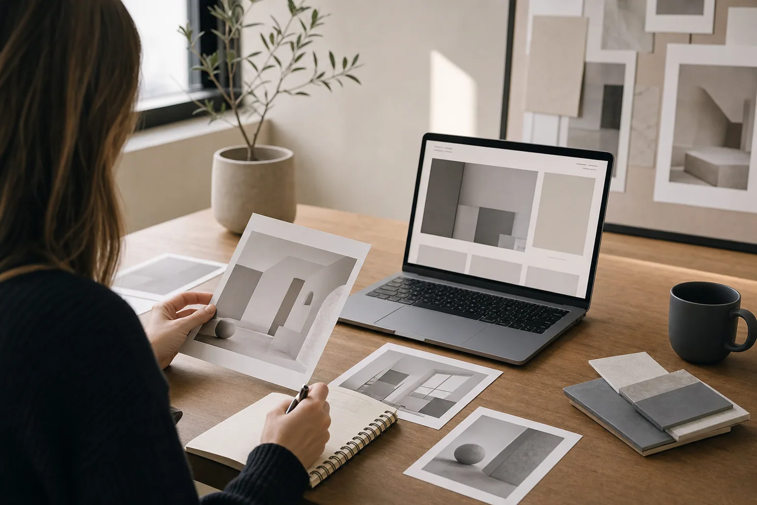
Your website's first impression happens in seconds. Before a visitor reads a word about your services, scrolls down to learn more, or finds a call to action, they are already forming an opinion based on what they see at the top of the page.
This matters because most people decide quickly whether to stay or leave. A cluttered layout, confusing message, or outdated design sends them away. A clear, professional homepage tells them they are in the right place.
The challenge is that many websites waste this critical moment. They use generic templates, pack too much into the top section, feature weak images, or bury the core message under noise. The result is a first impression that works against the business instead of for it.
What Happens Above the Fold
Above the fold is the part of your website visitors see without scrolling. On a laptop, this is roughly the top 600 to 800 pixels. On mobile, it is even smaller.
This space is valuable because it is what people see first. It sets the tone for the entire website. A strong above the fold design tells visitors who you are, what you do, and why they should care. A weak one makes them work to understand any of that.
Your above the fold real estate should do three things:
- State what the business does clearly and quickly
- Show that the business is professional and trustworthy
- Point visitors toward the next step
That sounds simple, but many websites miss one or more of these. Some have beautiful hero images but no clear headline. Others have headlines but no visual credibility. Still others have both but no clear path forward.
The Role of Professional Website Design
Good website design is not about being fancy or trendy. It is about clarity. A professional website design makes the business easier to understand and easier to navigate.
When you work with someone on website planning and development, the goal should be to build around your business, not a template. This means the layout, colors, typography, and imagery should reflect what you actually do and who you serve. It means every element has a purpose.
For example, a wellness brand does not need the same visual approach as a tech consultancy. A custom cabinetry company does not need the same structure as a creative agency. Each business has its own story to tell.
When your website design is built around your business rather than a preset template, the first impression becomes an honest one. Visitors see something real, not something generic.
Images Make the First Impression Stick
People process images much faster than text. A strong image at the top of your website tells visitors what your business is about before they read a single word.
Weak images do the opposite. Stock photos that have nothing to do with your business, blurry screenshots, or poorly lit pictures all undermine trust. They make the site feel outdated or inexpensive, regardless of how good your actual work is.
This is why image creation and photography matter so much for the first impression. Professional images of your work, your team, your space, or your services show visitors what they can expect. They build credibility and make the business feel real.
If you are a photographer, show your best work. If you are a service business, show your space or your team in action. If you are a product company, show the product in context. The images should answer the question: "What does this business actually do?"
Headline and Message Clarity
Your headline is the first words visitors read. It should tell them immediately what the business does and who it serves.
Weaker headlines are vague or focus on the business rather than the visitor. Examples include "Welcome to Our Site," "Leading Solutions," or "We Help Businesses Succeed." These could describe almost any company.
Stronger headlines are specific and benefit-focused. "Custom Websites for Service Businesses," "Brand Strategy for Wellness Companies," or "Photography That Tells Your Story" immediately communicate what is offered and who it is for.
Your headline does not need to be clever. It needs to be clear. When a visitor lands on your homepage, they should instantly understand what you do. If they are the right customer, they stay. If they are not, they leave knowing why.
Call to Action and Navigation
Above the fold should guide visitors toward the next step. This could be reading more about a service, viewing your work, requesting a consultation, or subscribing to updates.
Many websites bury the call to action or make it hard to find. Others use vague button text like "Learn More" or "Click Here." A clearer approach uses specific, action-oriented language: "View Our Work," "Request a Site Review," or "Start Your Project."
Navigation should also be simple and visible. A visitor should be able to understand your main service areas or the key pages of your site from the homepage navigation without guessing.
When your above the fold design includes a clear path forward, you make it easier for interested visitors to take the next step.
Building a First Impression That Works
Your website's first impression shapes whether visitors see your business as professional, trustworthy, and relevant. To strengthen it:
Start with clarity. Make sure your headline and opening message clearly state what you do and who you serve. A visitor should understand this in under 10 seconds.
Use strong visuals. Whether it is a professional photo of your work, your space, or your team, your image should support your message and build credibility.
Keep it organized. Do not crowd the above the fold section with too many elements, too many colors, or conflicting messages. Let each piece of information breathe.
Test on mobile. Most visitors see your site on a phone. The first impression on mobile is different from desktop. Make sure your above the fold design works and communicates on both.
Make the next step obvious. A visitor interested in learning more should know exactly where to click or how to get in touch.
Your website's first impression is your strongest chance to tell the right customer that you can help them. A website built around your business, not a template, makes that first impression honest and powerful. If your current site feels outdated, unclear, or generic, it may be time to look at what visitors actually see first and why it is not working.
Ready to strengthen your website's first impression? FultonStudio helps businesses clarify their message, improve their design, and organize their content so visitors understand the business from the moment they land on the page.