

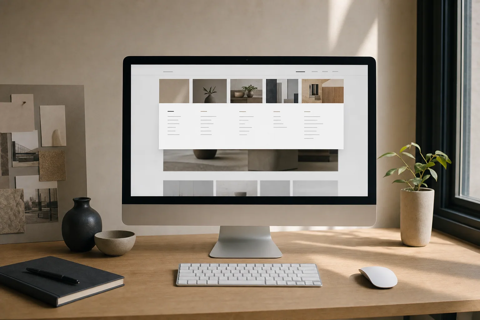
Your website's navigation is often the first thing a visitor sees after landing on your homepage. A clear website navigation design does two things at once: it helps real people find what they need, and it tells search engines how your site is organized.
Most small business websites struggle with navigation. The menu might be too long, the categories might not make sense, or the labels might be vague. When visitors get confused, they leave. When search engines can't figure out your structure, your pages rank worse.
Let's look at how to build navigation that actually works.
What Website Navigation Does
Navigation serves your visitors first. A person landing on your site should instantly understand what you offer and where to find it. They should not have to hunt, guess, or dig through a dropdown menu with 15 items.
Navigation also serves your search strategy. Google uses your menu structure to understand what your site is about and how pages relate to each other. A clear menu with logical page hierarchy helps search engines crawl and index your most important pages.
When your navigation makes sense, both visitors and search engines move through your site more easily.
The Problem With Generic Menu Structures
Many websites use the same cookie-cutter navigation because it comes built into the template. You see it everywhere: Home, About, Services, Blog, Contact. This works if your business fits that mold. But most do not.
A service business might need a menu that leads to individual service pages, case studies, and team bios. A product brand might need to show collections, featured items, and customer reviews. A wellness business might need to highlight classes, instructors, booking, and philosophy.
If you force your business into a generic structure, visitors do not understand what sets you apart. They see a template, not a real business.
How to Build a Website Menu Structure That Works
Start with your customer. What does someone new to your business need to understand?
A good website menu structure answers these questions:
- What does this business do?
- How can I work with them?
- Do they have proof it works?
- How do I get started?
Your top-level menu should be short. Three to six main items is typical. Each item should lead to a clear category or page, not a vague concept.
Here is a simple approach:
- Home (your homepage)
- What You Do (your main services or products)
- How It Works (your process, approach, or philosophy)
- Proof (case studies, testimonials, or results)
- Contact (how to reach you)
This is a starting point. Adjust it based on your actual business.
If you offer multiple services, consider grouping them under a parent menu. Do not create a dropdown with 12 service pages. Instead, create a Services page that showcases them, then link to individual pages from there.
For example, a consulting business might have:
- Services (parent page listing all service types)
- Strategy Consulting (sub-page)
- Operations Consulting (sub-page)
- Training Programs (sub-page)
This gives you one clear Services link in the main menu while keeping individual services findable and indexable.
Website Navigation Best Practices
Here are practical rules that help.
Use clear labels. "Solutions" is vague. "Branding Services" is clear. "Resources" might mean anything. "Guides" or "Case Studies" tells people what they will find.
Keep the main menu short. Aim for five items or fewer in your top navigation. If you have more, you have a hierarchy problem, not a menu problem. Reorganize your pages, do not add more menu items.
Match the menu to your business. If you are a trades business, show service areas, service types, and before-and-after work. If you are a consultant, show your methodology, case studies, and how to book. Build around the business, not a template.
Use breadcrumbs on inner pages. When someone is deep in your site, they should see the path they took to get there. Breadcrumbs help them navigate back and show search engines the page hierarchy.
Make the current page obvious. If a visitor is on your Services page, the Services link in the menu should be highlighted or marked as active. This removes confusion about where they are.
Test your navigation on mobile. Many visitors use phones. Your menu needs to work on small screens. Use a hamburger menu if needed, but make sure the expanded menu is easy to tap and read.
Create a clear footer menu. The footer is a second navigation area. Use it to link to important pages again, show contact info, and help visitors find what they missed in the main menu.
How Navigation Affects Search Visibility
Your website navigation design influences how well search engines understand your site.
When you organize pages under clear categories, you create topical clusters. Google sees that multiple pages are related and about the same subject. This helps those pages rank better together.
For example, if you have a Services page that links to individual service pages, and those service pages link back to Services, Google understands that those pages are related. All of them get a boost in relevance for your main service keyword.
A clear menu also helps with something called internal linking strategy. Each link in your menu is a vote for importance. If a page appears in your main navigation, you are telling search engines it matters. The more important the page, the higher it should be in your menu hierarchy.
When you rebuild or improve your website navigation, you have a chance to fix internal links at the same time. This is when to add keyword-rich anchor text, reorganize pages for better topical flow, and create clear pathways from broad pages to specific ones.
Common Navigation Mistakes to Avoid
Too many items in the main menu creates decision paralysis. Visitors do not know where to go.
Vague labels confuse both people and search engines. "Resources," "Solutions," and "Services" might all mean the same thing on different sites.
Isolated pages with no menu presence do not get traffic and do not get indexed well. If a page is important enough to exist, it should be findable from your navigation or footer.
Submenus that are too deep bury your content. Do not nest pages three or four levels down. Most visitors will never find them, and search engines give less weight to pages that are far from the homepage.
Ignoring mobile navigation loses visitors instantly. Half your traffic probably comes from phones. If your menu is hard to use on mobile, people leave.
Building Navigation Into Your Strategy
If your website feels outdated, unclear, or hard to navigate, your menu might be the place to start. Before you redesign anything, ask yourself: What does my visitor actually need? What is the clearest order to show my services, proof, and contact information?
Your answer becomes your menu structure. Then everything else on the site flows from that foundation.
A strong website navigation design is not just about making your site easier to use. It is about building clarity into your entire site structure. When visitors can find what they need and search engines can crawl your pages effectively, your website works harder for your business.
If your navigation feels confusing or your current site structure does not match what your business actually does, a clearer menu might be the missing piece. Start by listing what your visitors need to understand, then organize your navigation around that.