

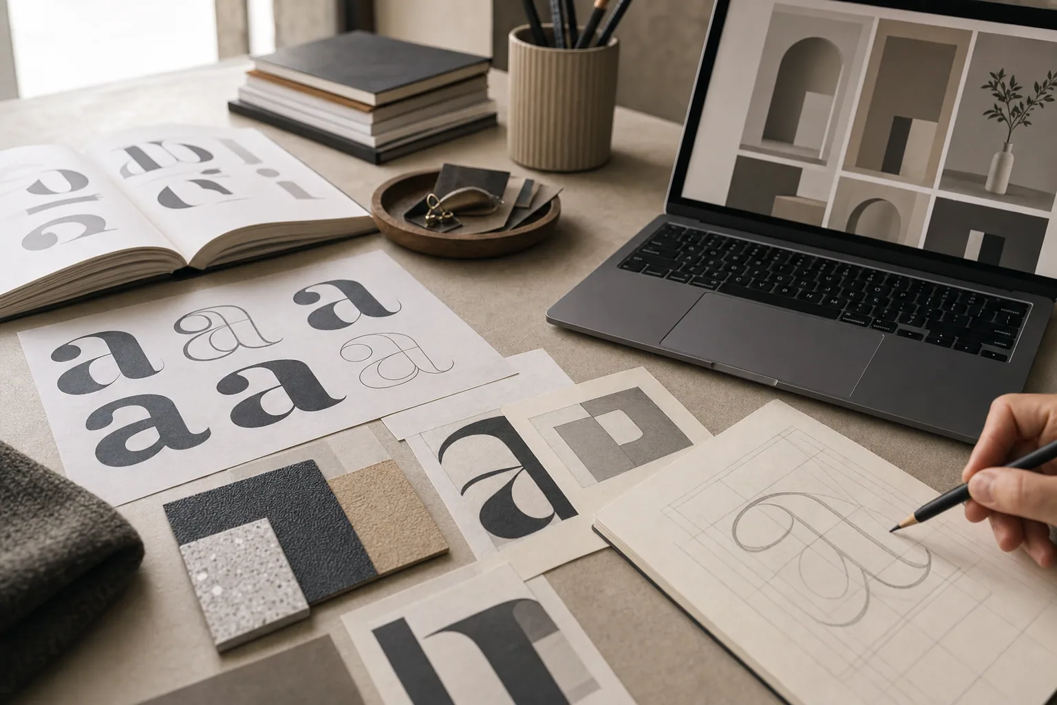
Typography is not decoration. The fonts you choose on your website affect how easily visitors can read your message, how trustworthy your brand feels, and whether people stay long enough to understand what you offer.
Many business owners inherit whatever fonts came with their website template, never thinking about why those typefaces were picked or whether they serve the business. Others pull fonts from trendy collections without considering how they work together or perform on different devices. The result is a site that feels generic, hard to read, or disconnected from the actual quality of the work.
Proper font pairing and website typography matter because they support your message. The right typefaces make copy easier to scan, help establish brand personality, and guide visitors' attention toward what matters most.
How Typography Shapes the Visitor Experience
Your choice of fonts is the first design system your visitors encounter. Before they read a single word, the typeface is already communicating tone, professionalism, and credibility.
Consider the difference between a serif font (like Georgia or Playfair Display) and a clean sans-serif (like Inter or Montserrat). Serifs often feel established, editorial, or sophisticated. Sans-serifs feel modern, approachable, and direct. Neither is wrong. The choice depends on what story your business tells.
When someone lands on your homepage, they form a quick impression. Typography contributes to that impression. A site built around a template often uses generic fonts that could belong to any business. When you choose typefaces that match your actual brand and audience, the site immediately feels more intentional and more professional.
Type also affects readability. Small fonts force people to strain. Low contrast between text and background makes copy disappear. Fonts that are too condensed or too wide create awkward line breaks on mobile. These are not stylistic complaints. They are friction points that push visitors away.
The Importance of Font Pairing
Most websites need at least two typefaces: one for headlines and one for body text. The pairing matters as much as the individual choices.
A good font pairing creates hierarchy without chaos. Visitors should immediately understand what is a headline, what is supporting text, and what is a call to action. If every line uses a different typeface or size, the page feels scattered. If every line uses the same typeface, the page lacks visual structure.
When you pair fonts, look for complementary contrast:
- A bold serif with a refined sans-serif (example: Playfair Display for headlines, Inter for body text).
- A geometric sans-serif with a clean humanist sans-serif (example: Montserrat for headlines, Open Sans for body).
- A narrow, modern sans-serif with a wider, readable body font (example: Space Mono for headlines, Lora for text).
The pairing should feel deliberate, not accidental. If your headline font and body font look too similar, they create confusion. If they look too different, they feel disjointed.
Good font pairing also considers size, weight, and spacing. A heavy bold headline paired with a light gray body font can be hard to scan. A thin serif headline paired with a thick sans-serif body can feel unbalanced. The weights, sizes, and line spacing should guide the eye naturally from headline to text to call to action.
Web Fonts vs. System Fonts
Not all fonts behave the same way on the web. Understanding the difference matters for both design and performance.
System fonts are already installed on users' devices (like Arial, Georgia, Verdana, or San Francisco). They load instantly and feel native to each operating system. For many business websites, carefully chosen system fonts work perfectly well.
Web fonts are hosted files that browsers download and display. Services like Google Fonts, Typekit, or Font Awesome provide thousands of options. Web fonts offer more personality and control but add a small performance cost. Each additional font file can slow page load slightly.
Best practice is to limit yourself to two or three web fonts total. More fonts create bloat and confusion. If you use web fonts, pick trusted sources and avoid loading multiple weights and styles that are not used.
Many professional sites now use a hybrid approach: web fonts for headlines (where personality matters) and system fonts for body text (where reliability and speed matter). This balances design intent with readability and performance.
Web Fonts Best Practices
If you choose web fonts for your site, follow these straightforward guidelines:
-
Load only what you use. If your design calls for one headline font in regular and bold, do not load ten different weights. Each unused file is wasted bandwidth.
-
Limit to two typefaces maximum. One for headlines, one for body text. If your brand is more complex, add one accent typeface, but not more. Too many fonts scatter the visual message.
-
Ensure sufficient contrast. Text should have at least 4.5:1 contrast against its background. Light gray text on white backgrounds, for instance, is hard to read and hurts accessibility.
-
Test on mobile. Fonts that look great on desktop sometimes become too small, too tight, or too hard to read on phones. Line-height, letter-spacing, and font size all need adjustment for smaller screens.
-
Check readability at various sizes. Your body font at 14px should be easy to read. Your headline font at 32px should not feel cramped. Use real content, not just sample text.
-
Avoid trendy fonts for body text. A decorative headline font can trend come and go without damaging your site. Your body text needs to feel timeless. Save the personality for headlines and accents.
Typography and Brand Trust
When your website typography is clear, consistent, and matched to your brand, visitors trust you more. This is not a coincidence. Professional typography signals that someone cares about quality and detail.
A business with scattered fonts, inconsistent sizing, and hard-to-read text looks unfinished or careless, even if the actual service is excellent. A site with deliberate typography, thoughtful hierarchy, and accessible reading feels credible and organized.
This is especially important for service businesses, consultants, and creative professionals. Your website is often the first impression a potential customer gets. If the typography feels sloppy, they may assume your actual work is sloppy too.
When you work on brand strategy, typography is part of establishing that coherent visual identity. The typefaces you pick should match the tone, audience, and promise of your business. A luxury cabinetry company should feel different than a tech startup or a wellness studio. Typography helps communicate that difference without words.
When to Revisit Your Site's Fonts
If your website uses an outdated template or generic default fonts, it may be time to reconsider. Signs that your typography needs attention:
- Visitors complain that your site is hard to read.
- Your fonts feel generic and disconnected from your brand.
- Your body text is too small or too light to scan comfortably.
- Your headlines and body text do not feel related or intentional.
- You have more than three typefaces active on the same page.
- Your fonts look dramatically different on mobile than desktop.
A thoughtful typography refresh often does not require a full website rebuild. Sometimes it is as simple as swapping the headline font, increasing body text size, adjusting line-height, or improving contrast. Other times, it means choosing a new font pairing that better reflects your brand.
The goal is a site where typography supports the message instead of fighting it. Visitors should be able to read, understand, and act without thinking about the fonts at all.
If your website typography feels generic, hard to read, or misaligned with your brand, consider a professional review. FultonStudio helps businesses strengthen their visual direction and rebuild outdated sites with clearer messaging, better typography, and stronger design systems overall. Start with understanding what your brand actually needs, then build the visual foundation to support it.